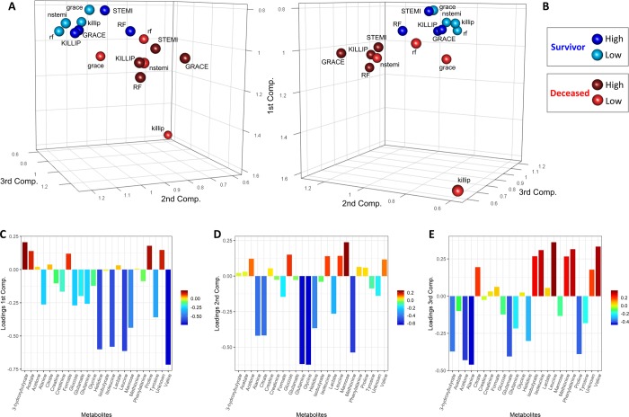
Figure 5.
Score and loading plots of the COVSCA model for the metabolite correlation networks obtained using the PCLRC algorithm. (A, B) Score plots of the first three components. Each sphere represents a network that corresponds to each mortality risk parameter analyzed. Blue spheres indicate patients that survive within 2 years after AMI, whereas red spheres indicate deceased patients. Light colors denote networks of patients at low risk of mortality, while dark colors are for networks of patients with high risk. (C, D, E) Loading plots of the first three components.

