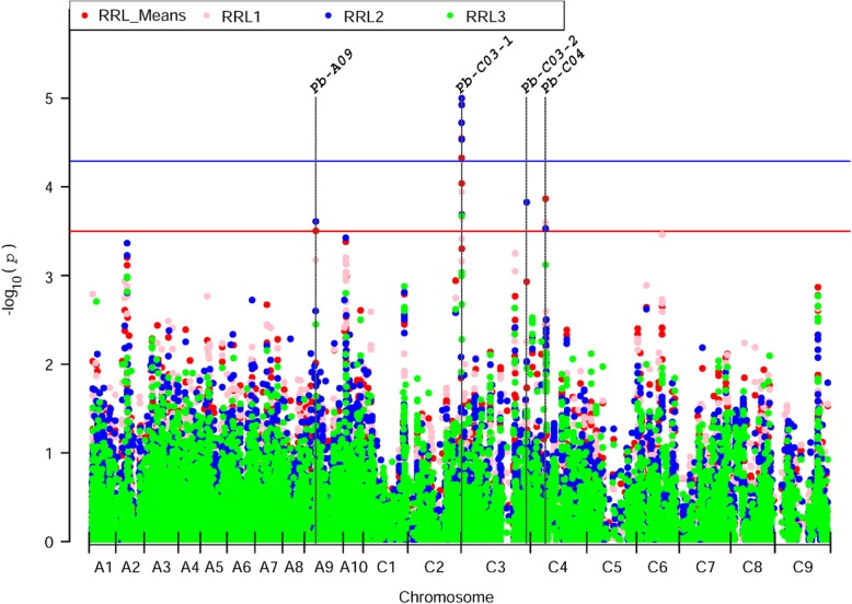
Fig. 2.
Manhattan plots of association analysis for RRLs using Q + K model. The red, pink, blue and green dots represent the association signals for RRL_Means (average value of three RRLs), RRL1 (RRL in replication 1), RRL2 (RRL in replication 2) and RRL3 (RRL in replication 3), respectively. The blue and red horizontal lines indicate the significantly associated threshold (−log10(1/19,945) = 4.3) and moderately associated threshold (−log10(p) between 3.5–4.3), respectively

