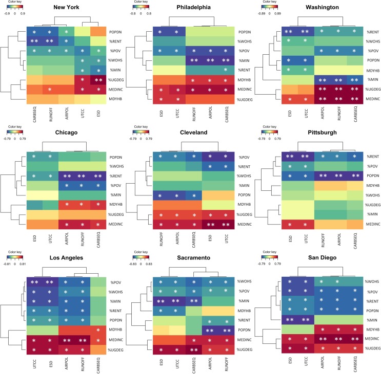
Fig 1. Clustered image maps illustrating partial least squares correlation analysis results for each city.
Cells shaded with warm colors (red, orange) have positive correlations while cells shaded with cool colors (blue, green) have negative correlations. Variable pairs with a correlation value greater than or equal to 0.5 but less than 0.75 are marked with one asterisk; pairs greater than or equal to 0.75 but less than or equal to 1 were marked with two. The same thresholds (but negative) and markings are used for negative correlation values.

