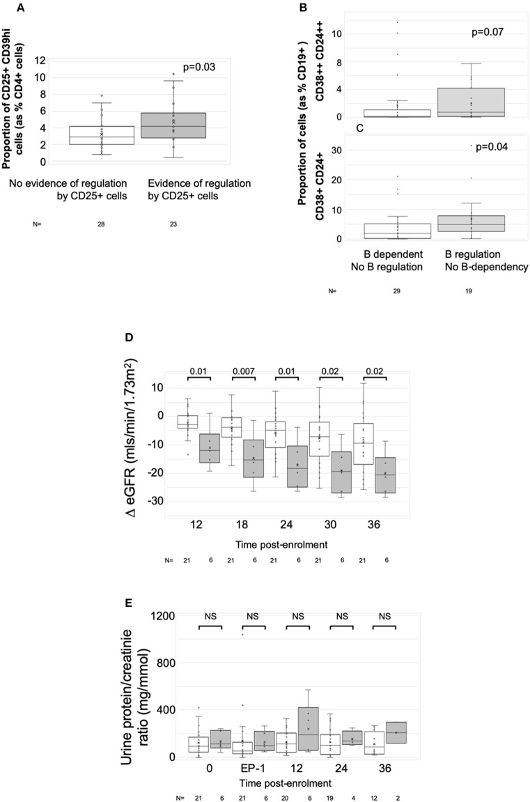
Figure 5.
Associations with ELISPOT patterns. Graphs show box plots of median with IQR with whiskers showing upper and lower limits and outliers indicated as single data points. Means are represented with “x.” (A) Association between proportion of CD4+CD25+CD39hi T cells (Tregs) and ELISPOT patterns characterized by spot count suppression when CD25+ cells present. (B,C) Association between proportion of CD19+ cells having the phenotype of transitional T1 cells (CD27-CD38++CD24++) (B) or transitional T2 cells (CD27-CD38+CD24+) (C) and ELISPOT patterns showing evidence of increasing spot counts after depletion of CD19+ cells. (D,E) ΔeGFR, normalized to enrolment eGFR of 0 (D) and urine PCR (E) in patients with at least two samples at end-phase 2 or beyond (n = 27). White bars are patients who had either donor non-responsiveness or ELISPOT patterns with evidence of regulated anti-donor responses in their post-optimization samples (n = 21). Gray bars are those with at least one post-end-phase 2 sample showing evidence of unregulated B cell dependent anti-donor responses (n = 6). Time points: 0, enrolment sample; EP-1, End phase 1; EP-2, End phase 2; 0–36, months post enrolment. P-values by Mann Whitney U-test.

