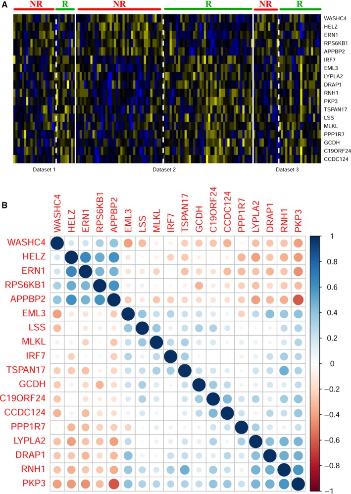
Figure 3.

A Heat map of 18 differentially expressed genes used in prediction models. Blue color indicated gene downregulation and yellow color indicated gene upregulation. NR indicates nonresponders and R indicates responders. Dataset 1, dataset 2, and dataset 3 are http://www.ncbi.nlm.nih.gov/geo/query/acc.cgi?acc=GSE19860, http://www.ncbi.nlm.nih.gov/geo/query/acc.cgi?acc=GSE28702, and http://www.ncbi.nlm.nih.gov/geo/query/acc.cgi?acc=GSE72970, respectively. B Correlation coefficient plot of 18 differentially expressed genes in http://www.ncbi.nlm.nih.gov/geo/query/acc.cgi?acc=GSE28702. Blue color indicated positive correlation and red color indicated negative correlation
