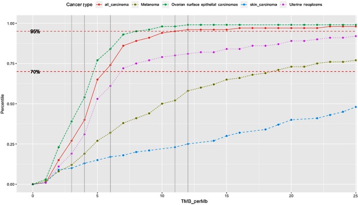
Figure 1.

Plot of tumor mutational burden (TMB) (x‐axis) vs percentile (y‐axis) for cancer subtypes. Gray vertical lines reflect the TMB values of EMPD cases on x‐axis and where they intersect with curves for different cancer types is where they fall in terms of percentile (y) for the specific groups. Red dots represent all carcinomas; dark green dots—melanomas; blue dots—skin carcinomas, green dots—ovarian surface epithelial carcinomas and purple dots—uterine neoplasms
