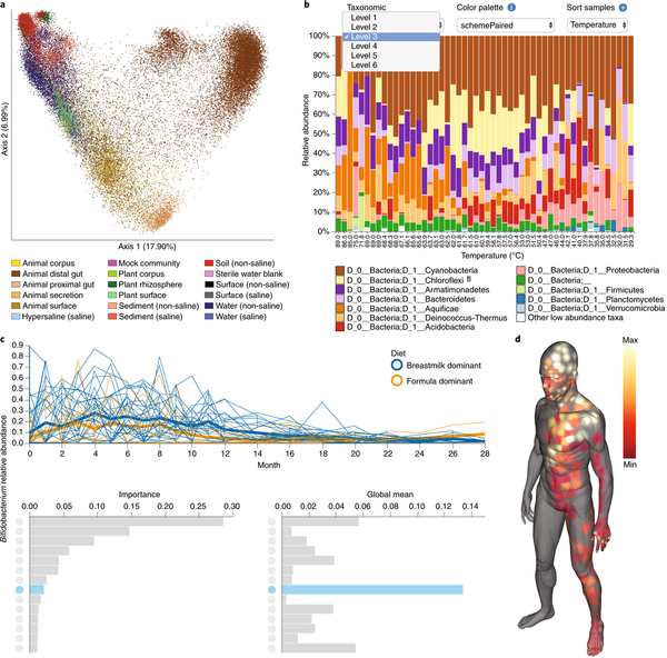
Fig. 1 |. QIIME 2 provides many interactive visualization tools.
The products of four worked examples are presented here, and interactive versions of these screen captures are available in Supplementary File 1 and at https://github.com/qiime2/paper1. Detailed descriptions and methods, including the commands used to generate each of these visualizations, are provided in Supplementary Methods. a, Unweighted UniFrac principal coordinate analysis plot containing 37,680 samples, illustrating the scalability of QIIME 2. Colors indicate sample type, as described by the Earth Microbiome Project ontology (EMPO). b, Interactive taxonomic composition bar plot illustrating the phylum-level composition of microbial-mat samples collected along a temperature gradient in Yellowstone National Park Hot Spring outflow channels (Steep Cone Geyser). The many interactive controls available in this plot vastly decrease the burden of exploratory analysis over QIIME 1. c, Feature volatility plot (https://msystems.asm.org/content/3/6/e00219-18) illustrating the change in Bifidobacterium abundance over time in breast-fed and formula-fed infants. Temporally interesting features can be interactively discovered with this visualization. Bar charts rank the importance (predictive power for time point) and mean abundance of all microbial features. These bar charts provide an interface for visualizing volatility plots (line plots) of individual features in the context of their importance and abundance; clicking on a bar will display the volatility plot of that feature and highlight in blue that feature’s importance and abundance in the bar charts below. d, Molecular cartography of the human skin surface. Colored spots represent the abundance of the small-molecule cosmetic ingredient sodium laureth sulfate on the human skin. Sample data can be interactively visualized in three-dimensional models, thus supporting the discovery of spatial patterns.

