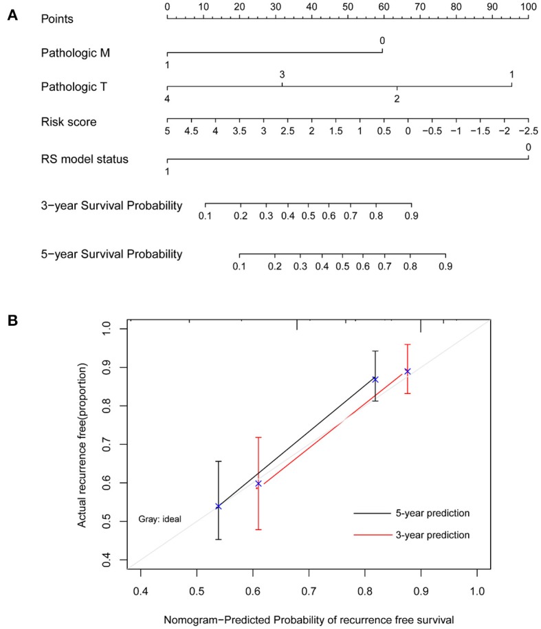
Figure 4.

Nomogram survival model. (A) The nomogram survival model. (B) The graph showing the consistency of the nomogram-predicted survival probability and the actual survival probability (the horizontal and vertical axes represent the predicted survival probability and the actual survival probability, respectively; black and red segments separately represent the 5-years survival rate and the 3-years survival rate in the group with the highest consistency).
