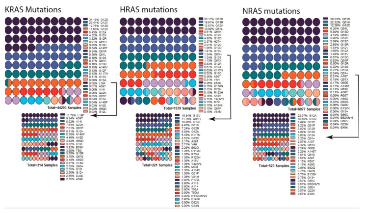
Figure 3.
List of mutations detected in each RAS gene isoform. Percentages are indicated next to the mutation, and colors indicate the mutation. Low-percentage mutations were shown as a smaller graph underneath due to their being almost invisible in first graph. Arrows indicate from which point onward graphs were cut into two. Color scheme repeats every ten mutations and should be interpreted in combination of percentages and order. Graphs were drawn by using Prism 8.

