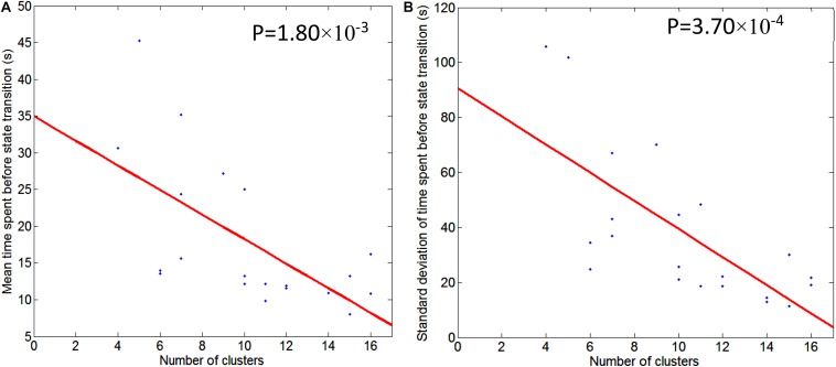
FIGURE 5.
Illustration of regression of mean/std of time spent before state transition with respect to the number of second level clusters. Graph (A) is for mean time spent before state transition and Graph (B) is for standard deviation of time spent before state transition. Regression line is shown in red, and scattered dots represent data points from 21 subjects. The p-value for the significance of the fit using the regression line is also indicated.

