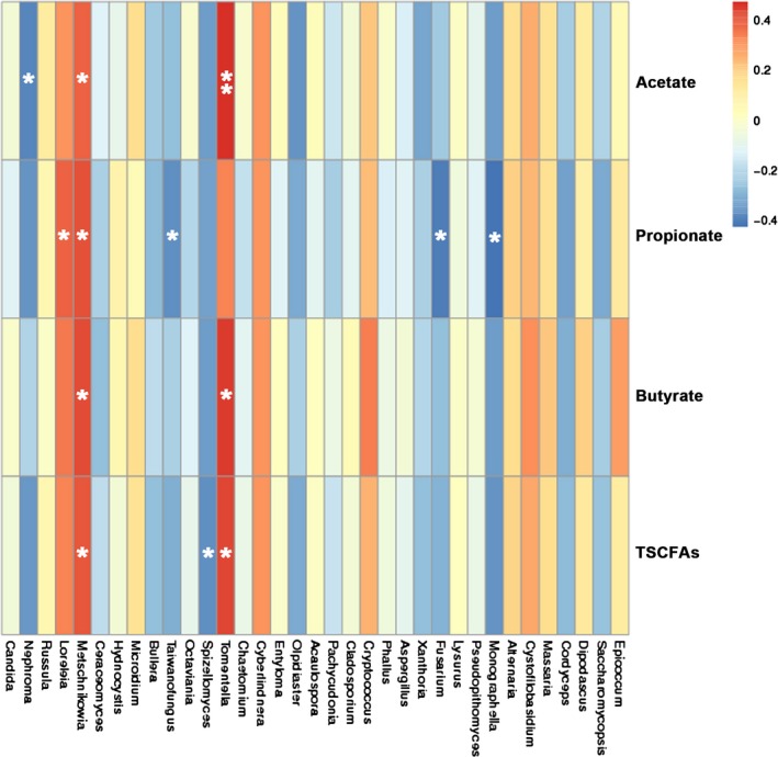
Figure 5.

The heat map of correlation between fungal genera and concentrations of SCFAs. Heat map was created according to the result of Spearman’s correlation analysis. Positive correlations are represented in red, while negative correlations are represented in blue. The significant correlations are presented as asterisks (*, P < 0.05; **, P < 0.01).
