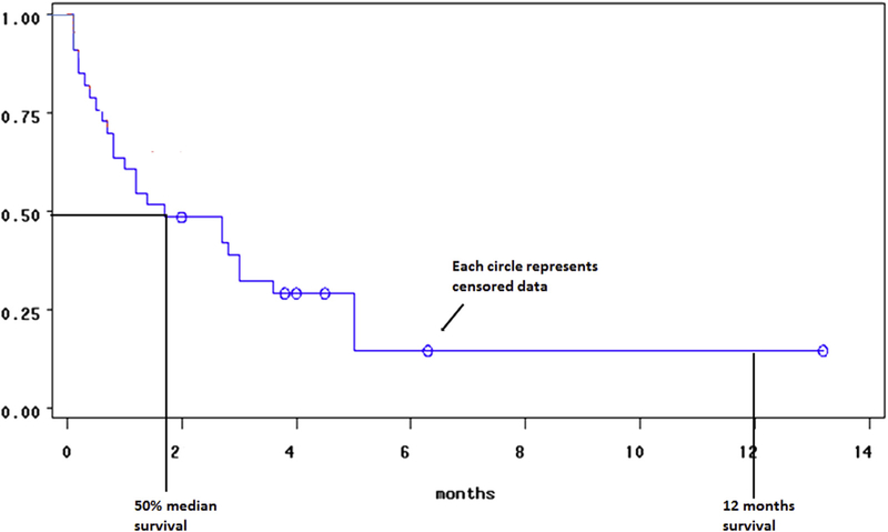
Fig 3.
Kaplan-Meier survival curve represents survival times. The x-axis denotes time and the y-axis denotes the percentage of a particular subject or object of interest has survived. Drops only occur at event times, and the curve does not go to 0 if there is no event at the last checkpoint or when the study has finished. The circle or dot points along the curve represent censored data. The curve allows us to plot the 50% median survival time and check survival at specific time points. In medical research, especially in cancer research, 1 and 5 year survival rates are used to establish the effect of treatment on survival.

