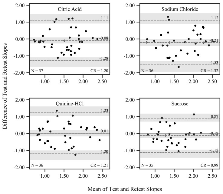
Figure 6.
Bland–Altman plots showing differences between qYN Test and Retest slopes plotted over session means. The mean difference is represented by the dashed line in the center, and upper and lower bounds of the limits of agreement (corresponding to the 95% CI of the differences) are shown as the upper and lower dashed line, respectively. The shaded areas correspond to the 95% CIs of these estimates.

