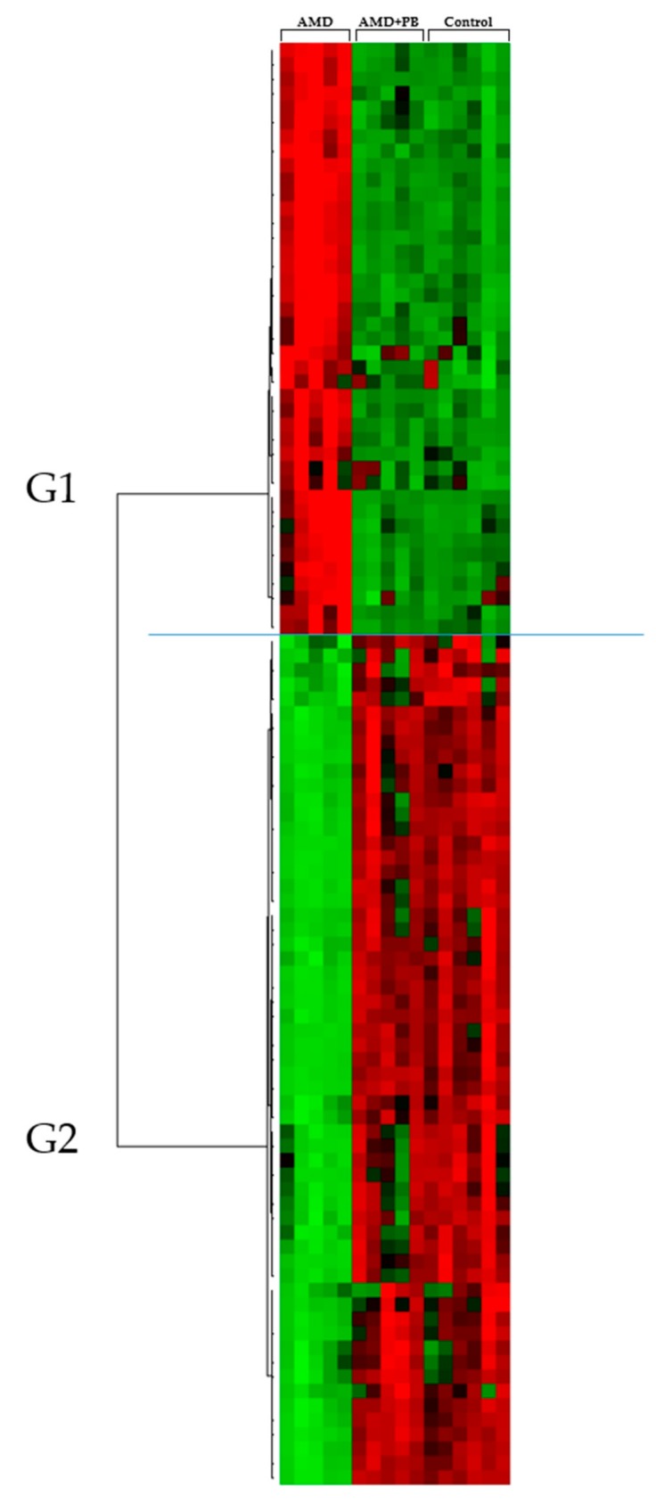
Figure 2.
Hierarchical clustering analysis of the UPLC-HDMS metabolomics results. The rows display the metabolites, and the columns display the samples. Metabolites that significantly decreased relative to the average level across the samples are displayed in green, while those that significantly increased are displayed in red. The brightness of each color corresponds to the intensity of the difference compared with the average value.

