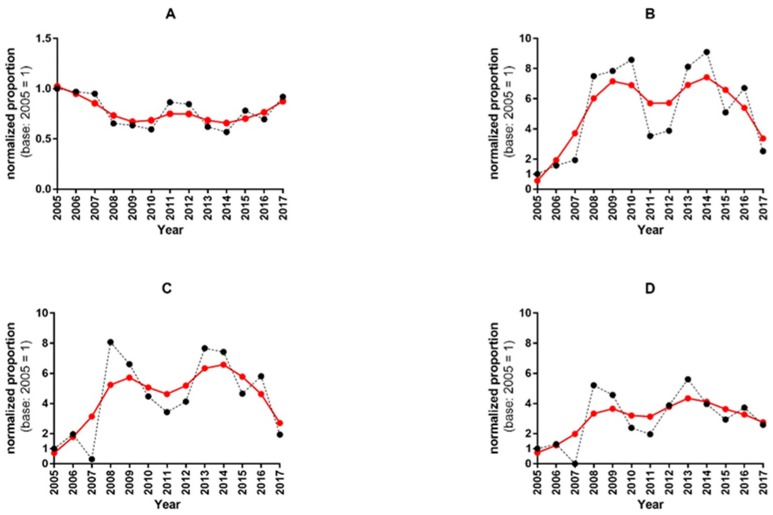
Figure 1.
Time course of the normalized proportions and their trend lines in HI titres. The panels (A–D) display the normalized proportions (black dots) of negative (5), positive (≥1:10, ≥1:20), and high positive (≥1:40) HI titres respectively, with the trend curves (red dots) estimated by using the Hodrick–Prescott filter. Panel (A): the dynamics of the time series shows values that are almost always lower than the base 2005 values. After 2014, the trend seems to have turned upwards towards the initial base level. Panel (B): the time series of the positive titres (≥10) shows a bimodal pattern, with peaks in 2010 and 2014, preceded by huge upsurges in 2008 and 2013. Peaks in the trend curve were observed in 2009 and 2014. Panel (C): the positive titres ≥20 show a similar bimodal pattern in the time series, with peaks in normalized proportions occurring in 2008 and 2013. The trend curve shows two peaks in the same years as that of the positive titres ≥10. Panel (D): the time series of the normalized proportions of highly positive titres (≥1:40) displays its highest values in 2008 and 2013. In the trend curve, the first peak is delayed by one year (2009), and the second peak coincides with the year 2013.

