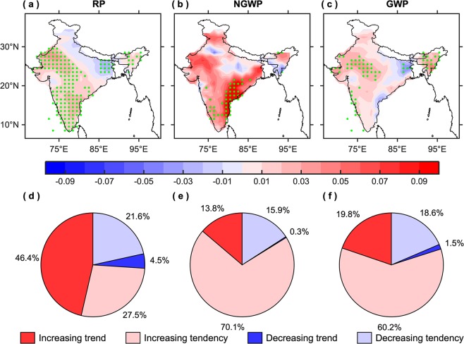
Figure 3.
Trends in the seasonal maximum intensity. (a–c) Spatial patterns of temporal trends (°C/yr) and (d–f) corresponding pie charts, illustrating the number of grids (in percent) having increasing and decreasing trend/tendency, in the maximum intensity for the AMJ season during the reference period (RP: 1951–2018), non-global warming period (NGWP: 1951–1975), and global warming period (GWP: 1976–2018). The green stippling indicates the grid points where the trends are statistically significant at the 95% confidence level. This figure was prepared using the MATLAB version R2017a software (http://in.mathworks.com).

