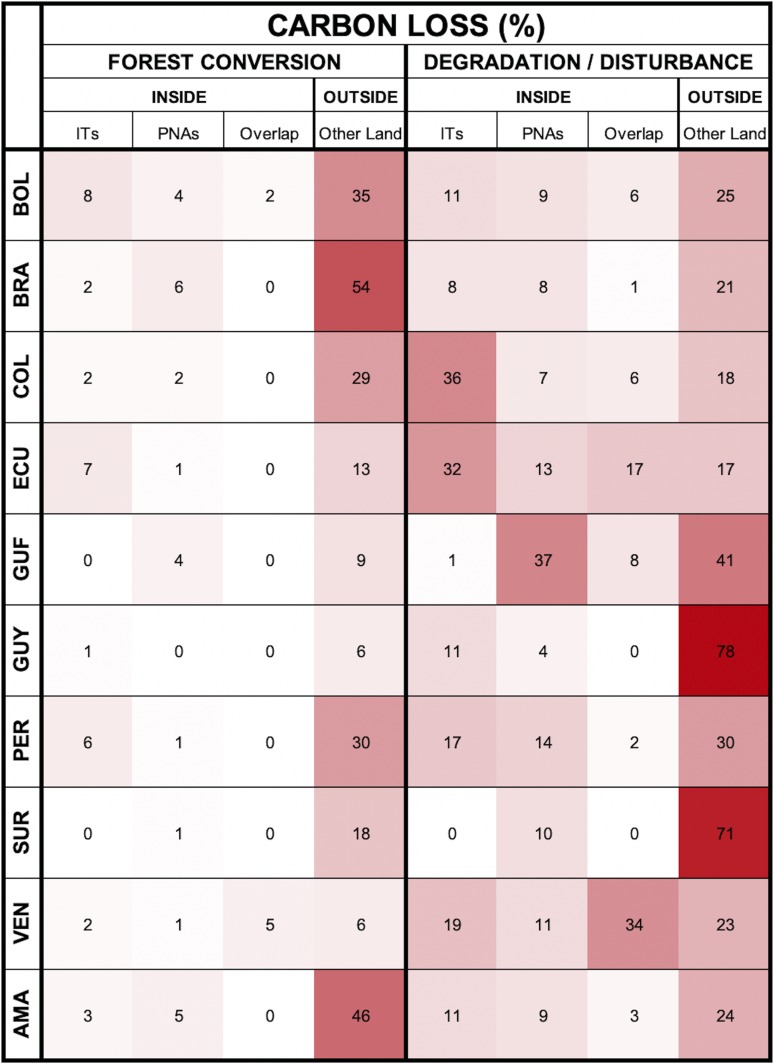
Fig. 5.
Amazonian carbon loss and its attribution. Rows correspond to a region (i.e., country/Amazonia), and columns refer to a land category (i.e., ITs, PNAs, IT/PNA overlap, and Other Land). Cell values (%) in each row represent the loss fraction in that category and sum to 100%; cell temperature (i.e., darker shades of red correspond to higher temperatures) increases with increasing loss fraction. The left half of the matrix, which illustrates losses from forest conversion, reveals a clear contrast between relatively high temperatures outside of protected lands and very low temperatures inside. The right half of the matrix, which summarizes losses from degradation and disturbance, is distinguished by warmer temperatures overall but lacks a clear pattern of attribution among land categories.

