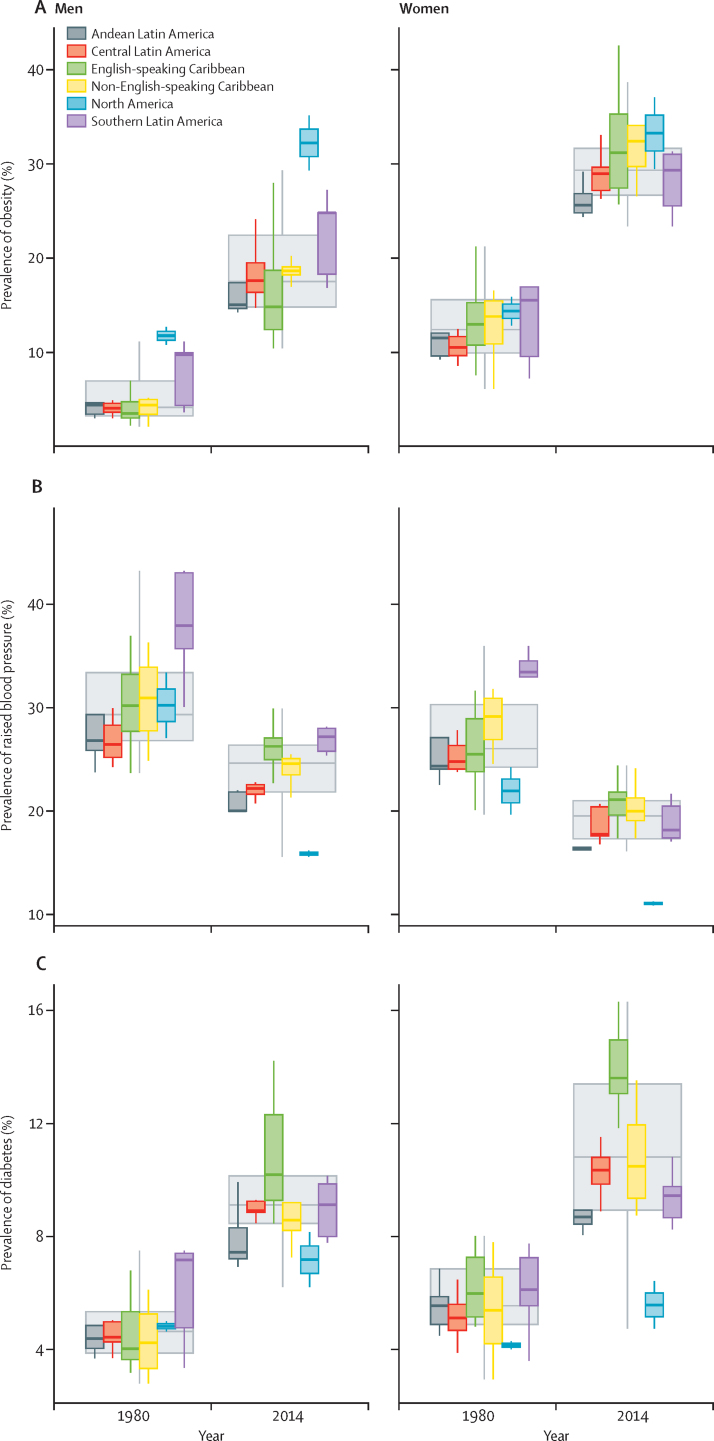
Figure 3.
Boxplot showing the distribution of of country-level obesity, raised blood pressure, and diabetes prevalence
Coloured boxes show how country-level prevalences are distributed within subregions (as opposed to population-weighted subregional means), and large uncoloured boxes show the country-level distributions for the Americas as a whole. Solid lines show medians, the boxes show IQRs, and the whiskers show ranges.

