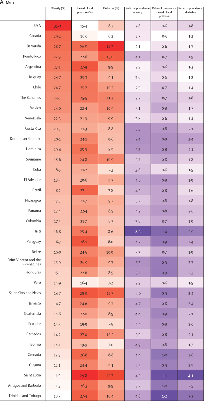
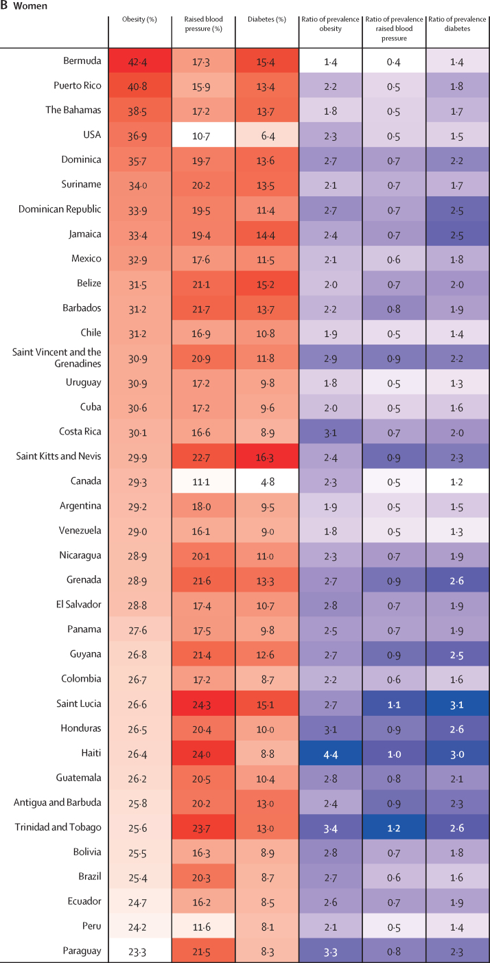
Figure 4.
Heatmap of age-standardised prevalence of obesity, raised blood pressure, and diabetes by country in men and women in 2014, and proportional change from 1980
Countries are ranked by the prevalence of obesity. The ratio of prevalence for each risk factor are calculated for 2014 values relative to 1980 estimates. For the first three columns, red indicates the highest level in the prevalence of that specific risk factor and white the lowest; for the last three columns, purple indicates the highest ratio of prevalence and white the lowest.


