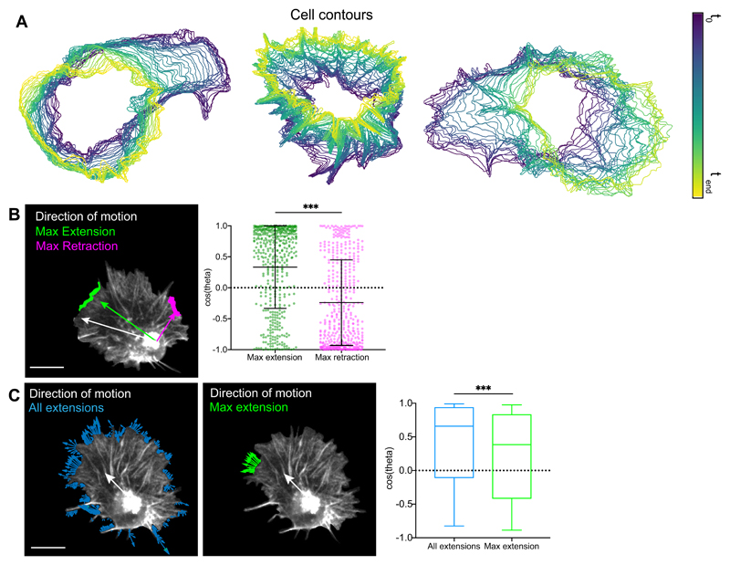
Extended Data Fig. 1. Leading edge fluctuations are a weak predictor of cell directionality.
(A) Three examples of cell contour analysis during hemocyte migration revealing highly dynamic edge activity.
(B) Left panel reveals a representative snapshot of a randomly migrating hemocyte with the maximum edge extension (green) and retraction (magenta) automatically tracked and compared to the direction of cell motion (white). Right panel shows that the maximum extension and retraction are positively and negatively correlated to motion. Note the high variance in the distribution. ***P < 0.0001, Mann-Whitney two-tailed test. The graph shows mean and SD as bars; each datapoint is displayed as a dot (n = 443, 9 biologically independent samples).
(C) Left panel shows a representative snapshot of all extension vectors around the cell perimeter (green) and maximum extension vectors based on the longest contiguous extension (blue). White arrow shows the direction of cell motion. Right panel shows the correlation of the resultant velocity of extension vectors to the direction of motion, showing that the resultant of all extensions is better correlated than maximum extension alone. ***P < 0.0001, Mann-Whitney two-tailed test. Boxplot shows medians as central lines, 25th and 75th percentiles as box limits, 10th and 90th as whiskers (n = 443, 9 biologically independent samples).

