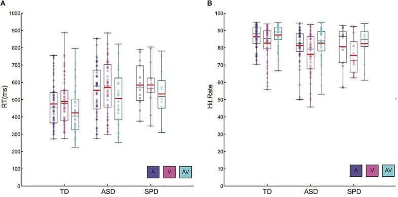
FIGURE 1.
Behavioral data. (A) Reaction time data for each of the diagnostic groups and the three stimulus conditions. Circles represent each participant’s mean RT for a given condition. Red horizontal bars indicate the mean across participants within a given group and condition. Black rectangles represents 25th and 75th group percentile bounds, and the horizontal black line within each rectangle is the group median. Whiskers extend to the minimum and maximum data points. (B) Hit rate data for each diagnostic group and condition. Plotting conventions are the same as those used for the RT data.

