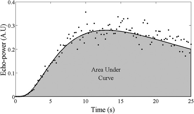
Figure 3.

Example of an echo-power versus time curve extracted from a region of interest in a tumor. The mean echo power measured for each image frame is represented by the black points. The curve fit to these data according to the log-normal model is represented by the solid black line. The shaded region represents the area under the curve for t = 0 to 25 seconds.
