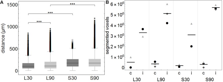
FIGURE 3.
(A) Boxplots of calculated distances of every none-positive voxel within the brains to the closest positive voxel. Distance values of all 3D reconstructed individual brains (approximately 3450 voxels per brain) were summarized according to the groups L30 = living animals, 30 min PI, n = 2; L90 = living animals 90 min PI, n = 3; S30 = sacrificed animals 30 min PI, n = 2; S90 = sacrificed 90 min PI, n = 3. Shorter distances equal higher tracer spread. When comparing living to sacrificed groups tracer spread is significantly higher in living animals at both time points (***p ≤ 0.001). Tracer spread is significantly higher 30 min PI compared to 90 min PI in living animals, while there is statistically significant difference in sacrificed animals over time. (B) This subfigure shows the total number of segmented voxels per hemisphere. Within each group, identical symbols represent the corresponding hemispheres of one brain. A line is depicting the mean value. “c” the contralateral and “i” indicates the ipsilateral hemisphere of the injection site. Due to the very small group sizes a reliable statistical analysis could not be performed. Nevertheless, a trend of higher spread to the contralateral hemisphere in living animals is visible.

