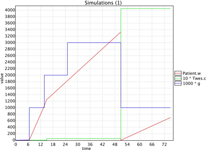
Figure 3.

A random simulation. This figure combines the output of a random simulation of a patient between the age of 0 and 74 in one graph: the red line represents the tooth wear in micron, the green line represents the costs in euro, and the blue line represents the tooth wear score (multiplied by 1000 to be representable in the same graph) [Colour figure can be viewed at https://www.wileyonlinelibrary.com]
