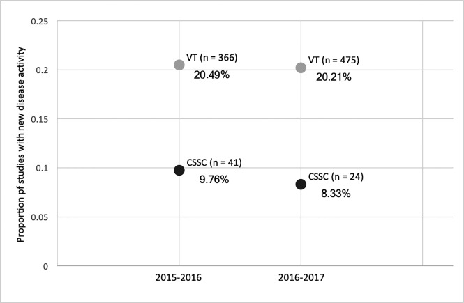
Fig 2.
The proportion of scans showing MS progression within each year. This scatterplot highlights the number of scans and the proportion in which new and enlarging lesions were detected for each study group during each year. The position on the vertical axis corresponds to the proportion of scans showing progression. The position along the horizontal axis corresponds to the study year. The lighter shade corresponds to scans generated with the software.

