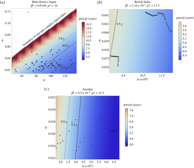
Figure 7.
Oscillation periods shown in colour as functions of α and δ as derived in equation (3.5). Actual demographic data of (αt, δt) are overlaid along with the band of periods above the 95% confidence interval obtained from spectral analysis of outbreak data. The period with maximum global power is marked with a thick dashed line. In the case of Japan’s Hida district in (a), the two points marked in red represent famine years, and most of the data points fall in the zone of complex eigenvalues that yield oscillating solutions. The entire demographic data for British India and Sweden fall within the zone of complex eigenvalues.

