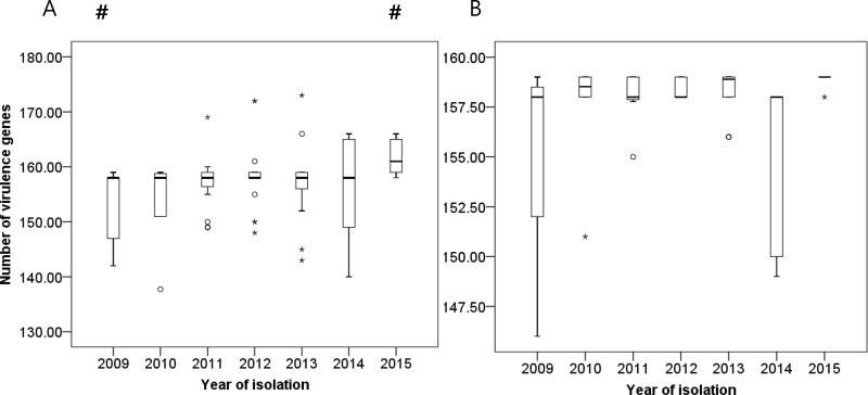
Fig 4. Changes in numbers of virulence genes according to year of isolation.
Bar graph represents medians, percentiles (25th and 75th), and 95% confidence intervals: (A) when all sequence types were included and (B) when only sequence type 191 was included. Circle (○) and asterisk (*) symbols indicate extreme values. Pound (#) indicates a statistically significant result (p<0.05) as compared to the rest of the year.

