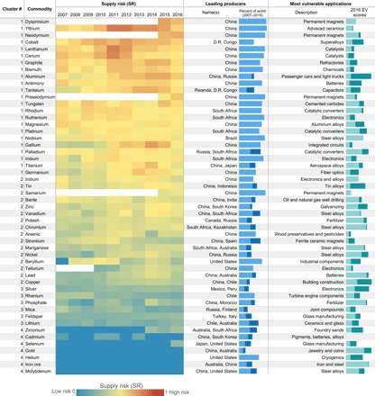
Fig. 5. Heat map displaying the SR for all commodities examined for years 2007–2016.

Warmer (i.e., orange to red) shades indicate a greater degree of SR. Commodities are listed in descending order of their 2007–2016 average SR and identified by cluster based on a hierarchical cluster analysis. Leading producing countries, based on primary production, are identified, and their share of world production from 2007 to 2016 is displayed in the stacked blue bars. The most vulnerable applications in 2016 are identified, and their contribution and the contribution of all other applications to a commodity’s overall EV are depicted in the stacked teal and dark teal bars, respectively.
