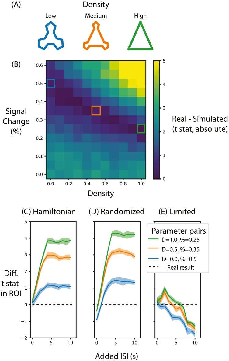
Figure 5. Alternative designs for Schapiro et al. (2013) and their relative test statistic.
(A) Depictions of representations corresponding to different densities. (B) A heat map of the difference between the real data and simulated data for different parameters of signal magnitude and density. Three pairs of parameters were chosen that minimize the difference between the simulated and real data. (C) For these three pairs of parameters, the average t-statistic in the ROI that was significant in Schapiro et al. (2013) was subtracted from the real data and compared at different ISIs when the stimuli were presented in a Hamiltonian sequence. The black line represents the real data. (D) is the same as (C) except that the sequence of stimuli was randomized in the simulation. (E) is the same as (C) except that the maximum duration of the run is limited, regardless of ISI. Shaded lines represent the standard deviation across the 10 permutations of this condition. ‘D’ in the legend refers to the density of the representation, ‘%’ refers to the percent signal change.

