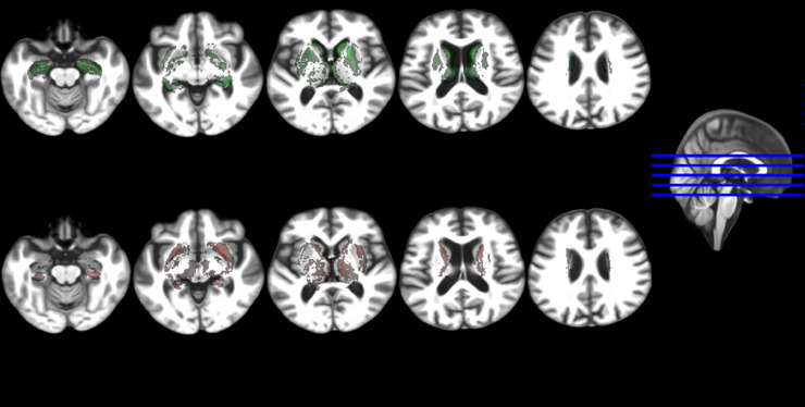
Fig. 2.
Five axial slices showing the voxel-wise differences between the probability distribution maps of the regions of interest analysed in the control group vs. the MCI group, all mapped in an age-relevant common template. The upper row shows in green the voxels where these differences (i.e. control map minus MCI map) are positives and the bottom row shows in red the voxels where these are negative.

