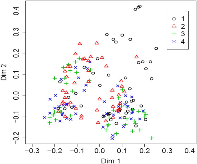
Fig 7. Proximity plot for the random forest classifier using the whole dataset (n = 179).
Four different categories: 1,2,3,4 (individual class) represent 1st quartile (Q1), 2nd quartile (Q2), 3rd Quartile (Q3), and 4th quartile (Q4) of total maize yield, respectively. The proximity matrix is represented by two dimensions (Dim 1 and Dim 2) using multidimensional scaling.

