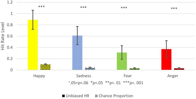
Figure 3.

This figure shows the Comparison between the Unbiased Hit Rate and the Chance Proportion, i.e., the hit rate that would have been expected by chance. Unbiased Hit Rate is colored with a full color, and the chance proportion is marked with dots. Each emotion is represented by a different color: Yellow for happiness, blue for sadness, green for fear, red for anger. Hit Rate mean is represented by the bar's height and standard deviation by the black brackets. The Significance level is marked: +0.05 < p < 0.06, *p < 0.05, **p < 0.01, ***p < 0.001.
