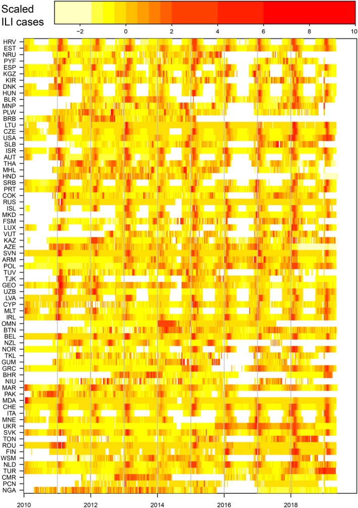
Figure 1.

Influenza‐like‐illness (ILI) data from the FluID database. Weekly scaled rates of ILI since 2010 for all countries that have reported for at least 50% of weeks, from FluID database. For each country, ILI was rescaled by removing the mean and dividing by the variance. Colours represent the intensity of ILI activity from low (yellow) to high (red). Colours are based on the percentile of the distribution of scaled ILI (see above colour bar for values), with white representing lack of reporting. This plot can be reproduced by evaluating the R script “launch_figure.r” in the directory “notes” in the group code repository.30
