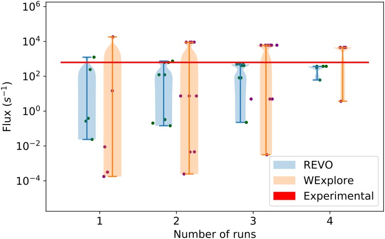
FIG. 8.
Average trajectory flux values are shown using all possible subsamples over the set of five runs. Individual averages are shown as points, and the probability of the subsamples is shown using a violin plot. The trajectory flux corresponding to the experimental residence time is shown as a horizontal red line.

