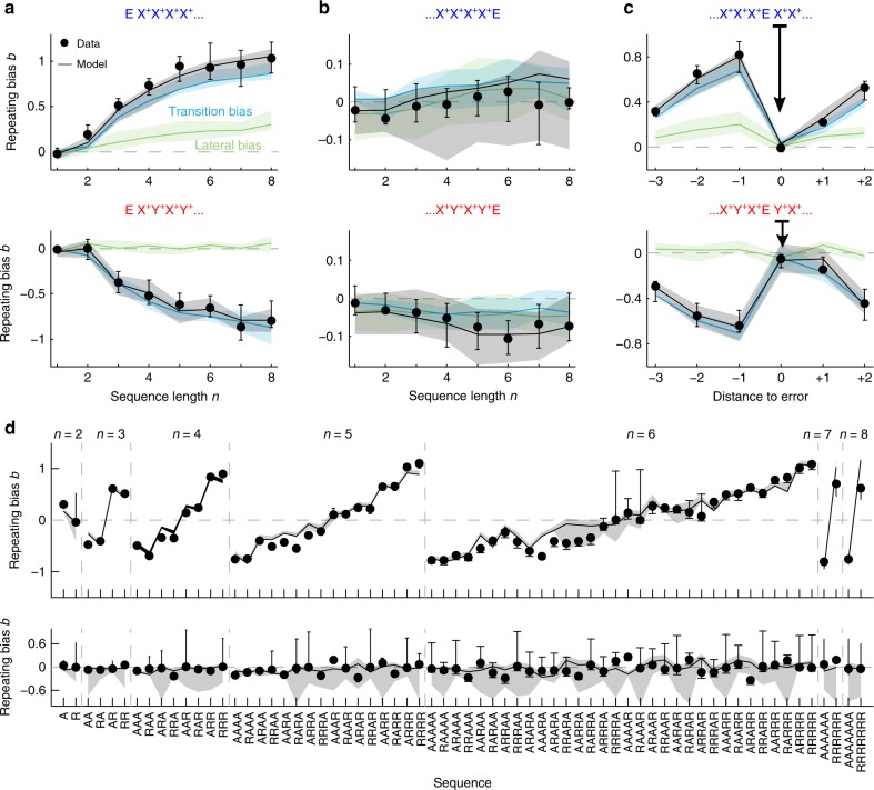
Fig. 7. Generative model simulation compared to experimental data.
Comparison between experimental data (dots) and model simulation (black curves) showing the repeating bias b for different trial sequences. In the model, b was decomposed into the transition bias contribution (blue curves) and lateral bias contribution (green curves). a Repeating bias b versus number n of correct repetitions (top) or alternations (bottom). Data are the same as the color curves in Fig. 2e. b Repeating bias versus n after a repetitive (top) or alternating sequence (bottom) terminated by an error (as black curves in Fig. 2e). Notice the different range in the b axes compared with a. c Repeating bias for sequences with an error E flanked by correct repetitions (top) or alternations (bottom). The bias b is given as a function the trial distance to the error response (distance zero represents b after the error). d Repeating bias for all sequences made of n ≤ 8 repetitions (R) and alternations (A). Top panel shows correct sequences while bottom panel shows correct sequences terminated by an error. In all panels, data and model show median across n = 10 rats. Error bars and shaded areas show first and third quartiles.

