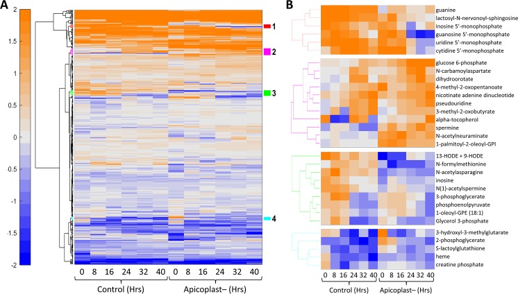
Fig 8. Metabolomic analysis of apicoplast-disrupted parasites.
A) Hierarchical clustering of metabolomic data from control and apicoplast-disrupted parasites at the indicated time points. Metabolomic data are shown for 405 metabolites that are present in both data sets. The data represent the abundance of each metabolite after normalization with their median value at the sampled time points. The hierarchical clustering method is the same as described above, except that we also used the k-nearest-neighbor method to impute any missing values in the data. The values are shown on a log2 scale with orange and blue colors indicating amounts higher and lower than the median value, respectively. B) Four clusters of metabolites that have temporal profiles which differ between control and apicoplast-disrupted parasites are colored in red, magenta, green, and cyan.

