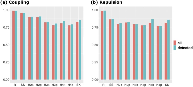
Fig 3. AUC for regions around causals.
Bar plot of the mean of AUC for regions around causals. This summary statistic indicates the extent to which the causal itself can be detected by GWAS without relying on the LD. The red bars show the results for the means of 100 simulation results and the blue bars show the results for the means of the simulation results whose QTN1 and QTN2 were detected. a: Results for the coupling scenario. b: Results for the repulsion scenario. The abbreviations of each method are the same as those of Fig 1.

