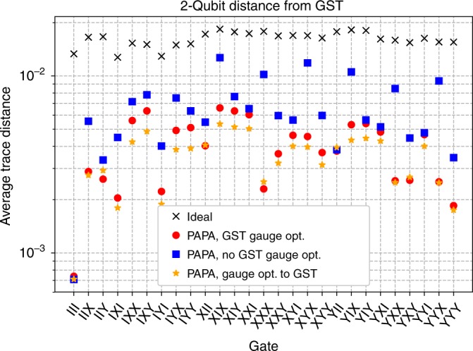
Fig. 6. Comparison of the GST measured process matrices to the ideal process matrices, and to a variety of PAPA reconstructions of the experimental data.

Red circles are the data points from Fig. 3 with GST gauge optimization, and blue squares have no GST gauge optimization. Orange stars have a further round of gauge optimization performed between the PAPA reconstructions and the GST measured process matrices. As in Fig. 3, PAPA data points are the average trace distance of the three reduced processes from there corresponding GST characterizations.
