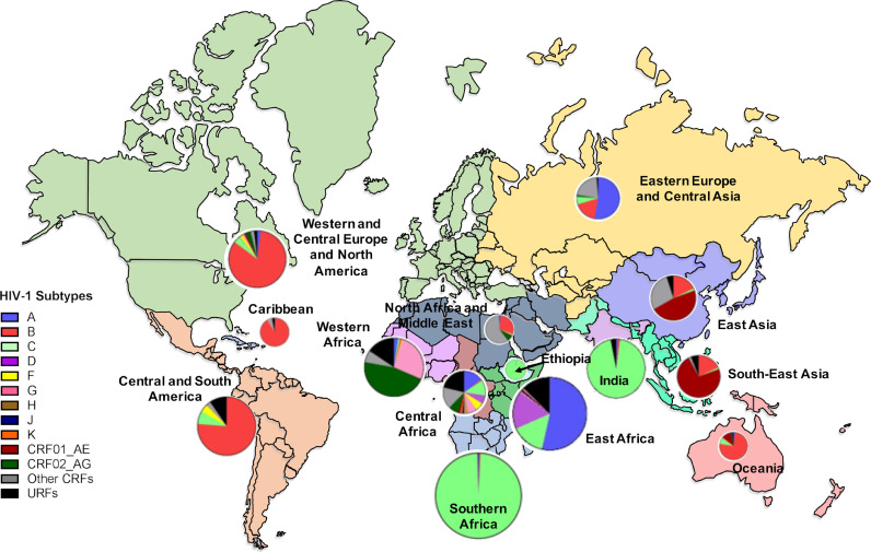
Fig. 1.
World map illustrating the prevalence of HIV-1 group M subtypes within each region. Pie graphs show the percentage of each subtype that circulates within a region and the size of each pie represents the total number of infections in that region. Each region is colour coded. This map was adapted from subtype prevalence data from Hemelaar et al., 20198 and infection prevalence data from UNAIDS Data 2019 (https://www.unaids.org/en/resources/documents/2019/2019-UNAIDS-data).

