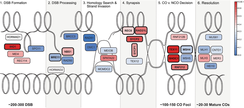
Figure 3.
Evolutionary rate of key recombination genes in the context of the recombination pathway. The double lines represent the looped dsDNA of two homologous chromosomes, one oriented across the top of the figure and the other across the bottom. Each panel, from left to right, illustrates the progression of a homologous recombination event. The process starts with hundreds DSBs throughout the genome, a fraction of which are ultimately resolved as mature crossovers. Additional information about each gene can be found in Table 1. The color of each gene represents its evolutionary rate relative to the average for recombination genes (ω = 0.3275): more rapidly evolving genes are depicted in darker shades of red and more conserved genes are depicted in darker shades of blue. The corresponding estimates of the evolutionary rate of each gene are reported in Table 3. Genes that exhibit a signature of positive selection are in bold.

