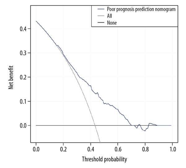
Figure 4.

Clinical usefulness of the poor prognosis prediction nomogram. The y axis represents net benefit. The x axis shows threshold probability. The blue line displays the benefit of our nomogram. The gray line suggests that all patients have poor prognosis, while the black line indicates that no patient has poor prognosis.
