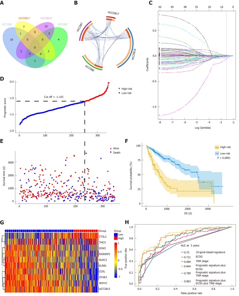
Figure 4.
Prognosis-related differentially expressed genes validated in four additional cohorts and construction of the prognostic gene signature. A: Venn diagram showing the results of genes validated in four cohorts; B: Circos plot showing overlapping genes between the four cohorts. Purple curves link identical genes while blue curves link genes that belong to the same enriched ontology term; C: LASSO coefficient profiles of 52 genes validated in four cohorts; D: Distribution of risk scores; E: Patients’ survival time and status. The black dotted line indicates the optimum cutoff dividing patients into low- and high-risk groups; (F) Kaplan-Meier curves for low- and high-risk groups; G: Heat map of ten key genes in the genes signature; H: Time-dependent receiver operating characteristic curves for comparing prediction accuracy among the ten-gene-based signature and clinicopathological features.

