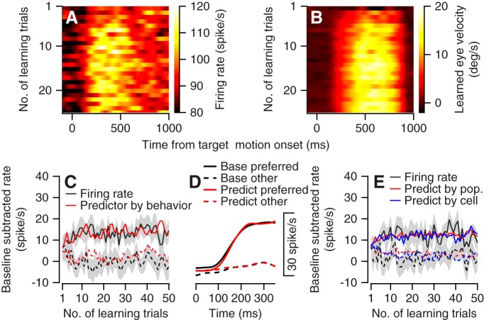
Fig. 8.
Comparison of time courses for changes in neural activity and behavior during reward learning. A and B: the population peristimulus time histogram and corresponding learned eye velocity as a function of the number of learning trials (y-axis) in the preferred learning conditions. In A the color of each pixel corresponds to the average firing rate of the population. In B the color of each pixel corresponds to the difference between the eye velocity components in the direction of motion of the large and small reward targets. C: the population learning curve (black) and rate predictor (red) for the preferred (solid) and nonpreferred (dashed) learning conditions. x-Axis corresponds to the number of learning trials; y-axis corresponds to the difference between the average firing rate during 750 ms of target motion and the baseline rate before target motion. Gray bands show the SE. D: the average firing rate in the base trial (black) and the linear model fit (red). E: the population learning curve and behavioral predictor calculated from the first 350 ms of movement. Black traces show the rate learning curve. Red traces show the predictor based on the population rate and behavior. Blue traces show the predictor constructed individually for each cell and then averaged across the population. In C–E, solid and dashed traces show data for the preferred and nonpreferred learning directions. We preset the number of learning trials per condition; since conditions were randomly interleaved, the numbers presented are approximately half the number of the learning trials in the session.

