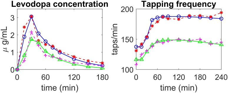
Fig 4. Examples of model fitting to real data in two patients of the first group (stable).
The left panels show LD concentration in plasma, the right panels the finger tapping rate. Patient 5—experimental data: dashed red lines with asterisks; simulation results: continuous blue lines with open circles; Patient 6—experimental data: magenta dashed lines with crosses; simulation results: continuous green lines with triangles.

