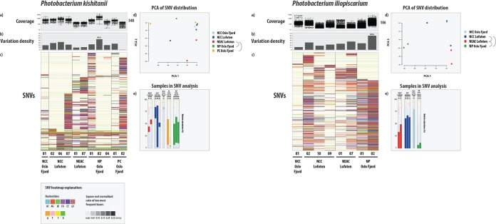
FIG 4.
SNV variation analysis of the two most abundant bacterial genomes in the microbiomes of gadoid species. For each genome, the figure displays read coverage per single nucleotide variant (SNV) position in each sample from the different species/ecotypes (a) (mean coverage on right side of plot) and variation density (b) (number of variable positions per 1,000 bp reported in each individual sample, independent of coverage in the other samples) per sample (maximum value indicated). The y axes of the coverage and variation density plots are scaled across the genomes. (c) Heat map of a randomly chosen subset of 400 SNVs. In the heat map, each row represents a unique variable nucleotide position, where the color of each tile represents the two most frequent competing nucleotides in that position. The shade of each tile represents the square root-normalized ratio of the most frequent two bases at that position (i.e., the more variation in a nucleotide position, the darker the tile is). See legend at the bottom of the figure. (d) Principal-component analysis (PCA) plot of the SNV distribution (within-species variation) among the different samples. Each sample is represented by a dot, and colored according to species or ecotype membership. Half-circles to the right of the legend indicate species or ecotypes with significantly different within-species variation (i.e., different strains). (e) Relative abundance of the different samples used in variation analysis. The bars are colored according to the SNV plot in panel d.

