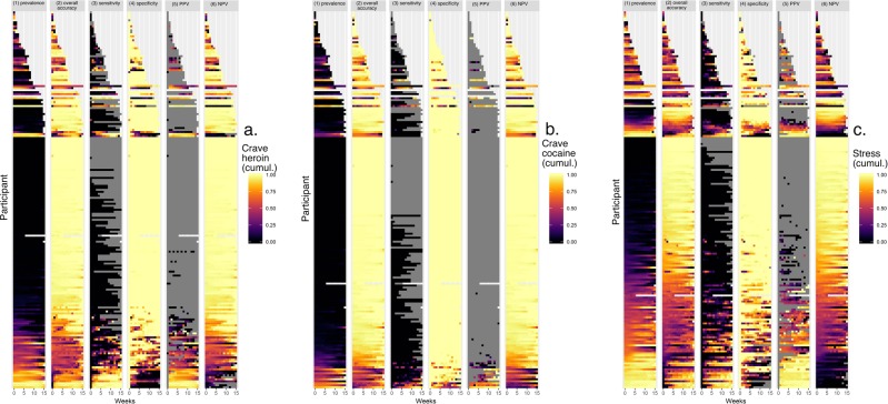
Fig. 3. Prediction accuracy (and prediction-target prevalence) per person per week, for each participant.
These heat maps recapitulate prevalence (column 1) and show model accuracy per person per week (column 2, overall accuracy; 3, sensitivity; 4, specificity; 5, positive predictive value; 6, negative predictive value). In columns 2–6, the color scheme is as follows. White: missing data. Gray: accuracy not calculable due to non-occurrence of event. Purple/black: low accuracy: Orange and yellow: high accuracy.

