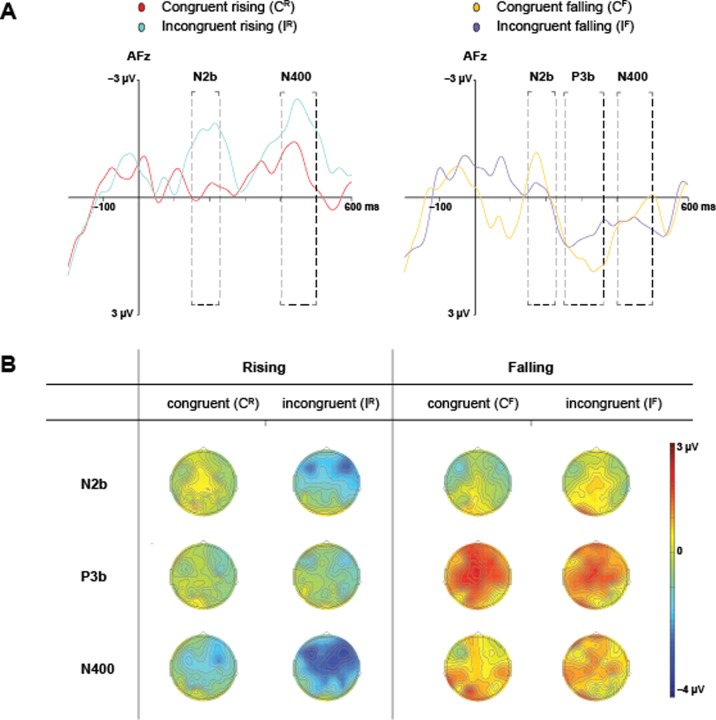
Fig 3. Grand average waveforms and scalp maps.
(A) shows the grand average ERP waveform for all participants at electrode AFz. The left graph contrasts the waveforms for congruent and incongruent items with rising speech contours. The right graph contrasts that with falling contours. Dashed boxes demarcate latency windows used in the statistical analyses for the N2b (150–225 ms), P3b (250–360 ms) and N400 (400–500 ms). The y-axes denote amplitude in microvolts (-3 μV to 3 μV). The x-axes time in milliseconds (-200 ms to 600 ms). (B) contains topographical maps that display the scalp distribution averaged over the latency windows used in the analyses.

