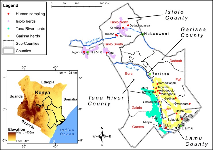
Fig 1. Map showing the study areas with specific villages samples indicated by red dots, towns indicated by green spots and herd movement routes in different colors as per the legend.
(Source: 30m Digital Elevation Model from USGS was used to generate the insert map. County and Subcounty shapefiles were obtained from Kenya Open Data portal and the pastoralist migratory routes were monitored using GPS collar. The map was generated using ArcMap 10.2.2 from ESRI).

