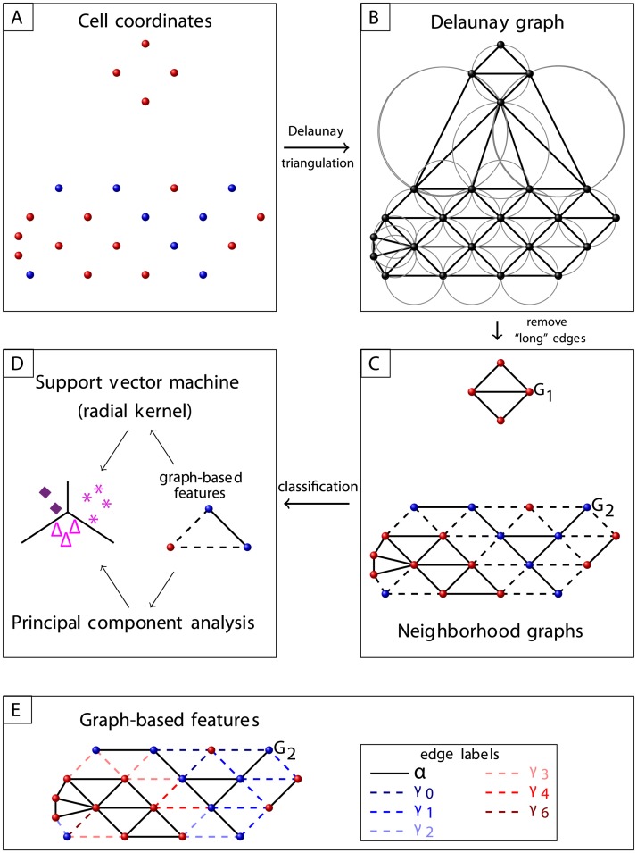
Fig 2. Graph workflow.
A: Blue and red dots represent cells of different phenotypes. B: Cells’ Delaunay graph. C: Neighborhood graphs G1, G2, where triangles with large circumcircle radius were excluded. Edges between cells of different phenotype are illustrated as dashed lines. D: Classification based on the composition of nodes and edges. E: Illustration of edge labels used in the feature κ(a), see Section Features of infiltrates; nodes of type A are represented in red. For the illustrated graph G2 = (V, E), and .

