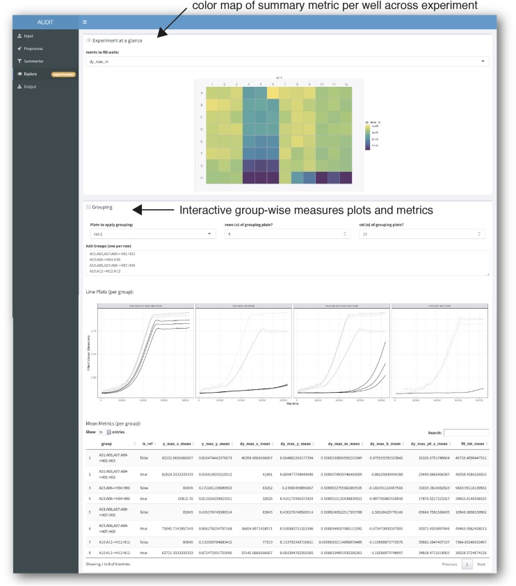
Figure 6.
Explore the distribution of summary metrics across an experiment and by group. Screenshot of AUDIT’s explore panel. The researcher chooses a summary metric and AUDIT creates a color map across the wells in an MTP view plot (arrow, top). Users can specify Reference-target groups interactively. AUDIT will generate line plots of the fitted growth curves along with a summary table of per-group means for each numeric summary metric computed.

